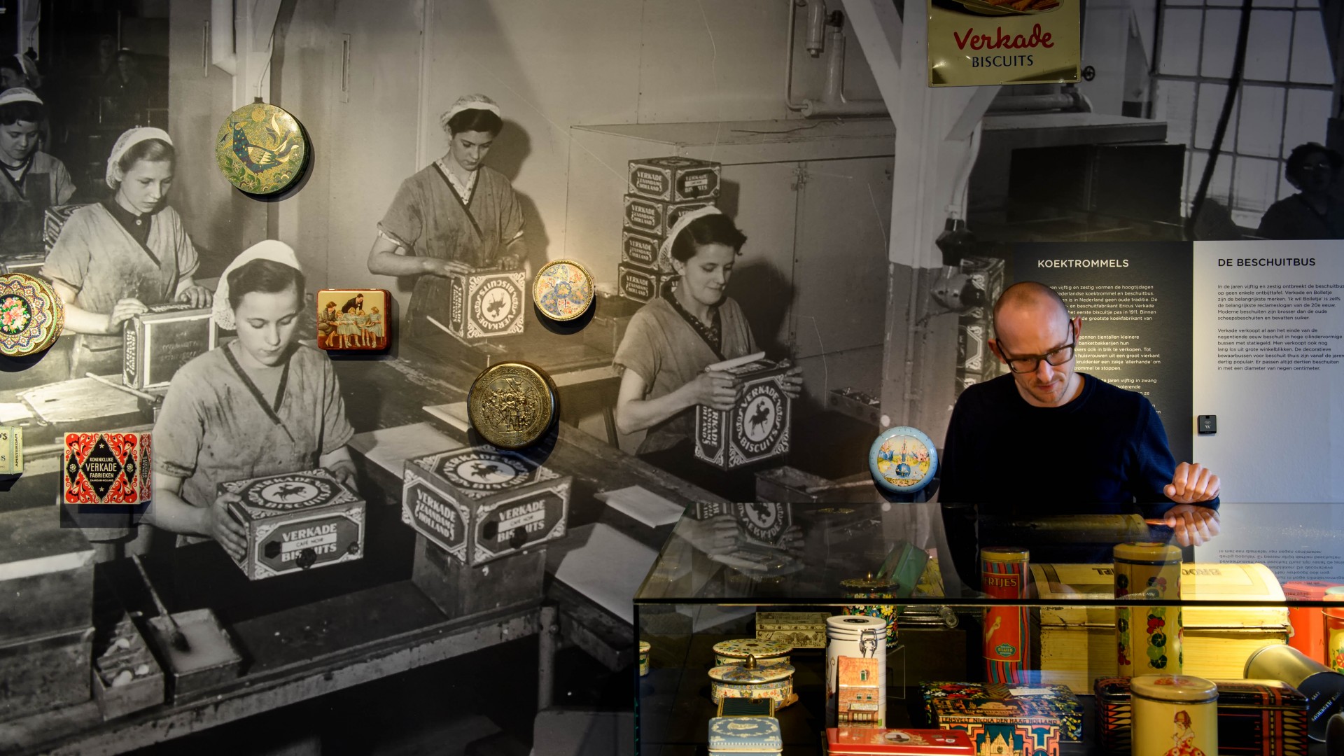
A collaboration of three design agencies from Deventer resulted in the design for the exhibition on 100 years of tin in Deventer: 'TIN. From cans to art' at Museum de Waag. The graphic designers from Houdbaar, multimedia designers De Mannen Zonder Pak, and spatial designers from Studio Groen+Schild each shaped three themes surrounding tin in very different ways on the three floors of the museum.
On the ground floor, Deventer as a tin city takes center stage. Circular spaces are created with hundreds of tins. A film on large paint cans showcases the history of the tin can and its production in Deventer.
On the first floor, a long exhibition wall is created with a ribbon of tin directly from the roll. The theme on this floor is Design and reuse. Tin is indeed 100% circular.
The top floor highlights gastronomy. Tin is becoming increasingly popular in restaurants. Chefs and their dishes are projected onto plates on a long set table. Here, nine chefs serve their culinary masterpieces with products from tin.
Photography: Mike Bink
Projectteam Studio Groen+Schild:
Ellen Schild, Thijs Bongers
